Tuesday 19 June 2012

By Nord Copenhagen


Of late, my obsession with things with animals on has got a bit slack. I went through a phase of hunting out all things animal/interior related and couldn’t stop but in recent months I think I have exhausted it a little. So when I saw these pieces from By Nord, the love of all things animal came flooding back. These powerful pieces are from design pros By Nord, a brand where beauty and functionality are key, using epic imagery they create dramatic pieces. The collection consists of tea cosy’s, cushions and tea towels. My personal favourite is the black and white moose tea cosy, it’s just so cool and I won’t lie, Moose’s really make me giggle (I think it’s because they always look so happy.) But I also love their feather pieces, they are so delicate and the photography is just beautiful. You can check out more of their line here or buy it from Cloudberry Living.  
Sophie xo


Monday 18 June 2012

Bold & Noble


Although the Jubilee may be over, those of us who live in London still have to face the onslaught of ‘Olympic spirit’. Don’t get me wrong I’m pretty excited, but I still have to go to work on the tube…not so excited about being squished for two weeks. I cant help being a bit of a London grump, but I love my city so feel I should at least support it a little bit…even if it is just a little. So these typography maps from Bold & Noble are just perfect, they are full of some of my favourite things. Typography, London and hand screen printing. So like I said as a Londoner my first instinct when looking at their vast collection of cities and countries was to get the London map. At a large 70 x 50cm I love this bold piece of graphics, and could stare at it for hours. But never fear, if you’re not from London, also featured is Cornwall, Ireland, Italy, New York, Germany, and various other destinations. If that doesn’t suit, they have a world map too, and plenty of other prints to keep you grinning from ear to ear. Probably the best part is the price, ie: I can actually afford one!! Check out the whole range right here.
Sophie xo


Korento dinnerware


I am a big fan of modern looking pieces, clean lines, bold shapes, I want all of that. But I love something with a little history to it, something with a bit of vintage, old school, belongs at your grandma’s house vibe to it. When the two come together they can sometimes just be a bit of a disaster but today I’m looking at Littala’s range of Korento ceramics, that just works oh-so well. These beautiful nature inspired pieces come from design combo Klaus Haapaniemi (who’s work I love! Follow up post coming soon) and Heikki Orvola. Klaus produced the stunning pattern, Heikki moulded it to fit the plates and cups. The use of rich colour and floral inspiration create a pattern that reminds me of summer and spring where everything is just right and the flowers are in bloom. Even better – this comes in two colour ways, a blue and an orange. My particular favourite piece from the collection are the 30cm plates, I love the design in both colours…but can’t decide which is prefer so I could just buy both? Find out more information here, and you can buy them from Cloudberry Living.
Sophie xo
Ps: Don't forget voting for the new bistro set is still open!


Sunday 17 June 2012

Vote for a Bistro chair!


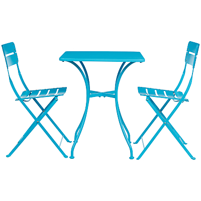
As I have said before in a few weeks time I’m planning on moving house, one thing we really want is a teeny tiny balcony so we can sit outside and be fancy with a coffee in the mornings. I have gladly taken it upon myself to seek out a nice looking bistro table and chairs. So I call upon all my lovely readers to pick which one!! I hereby bequeath to you the decision of table and chairs for my outside area, I have three options for you so enjoy:

Option one.
The IKEA LÄCKÖ bistro table, a sleek black number. This table really brings the French bistro style to life, the smooth curves and fluent lines make this table an elegant option.

Option two.
Next is the John Lewis Loft table set, in a super bright popping blue. This option just has summer written all over it. It’s fun, quirky and bright and is just the perfect option for brightening up anyone’s morning.

Option three.
Finally is the Rosso and Parc combo from Ikea. This is a mixture of two styles, the white table and red combo are the best sides of two worlds. The bright red chairs add a real pop of colour, but the simple white table keeps it nice and down to earth, perfect for both summer and winter.

You can vote just on the right hand side of the screen! So get voting! I am rubbish at decision making.
Sophie xo


Friday 15 June 2012

NUD Concrete fitting


As my love affair with all things lighting continues I have got really into using raw materials in light fittings. From copper to concrete, I just love the use of rough materials that have bundles of texture and a story to tell. NUD have long been at the forefront of modern lighting, their creative work with lightbulbs and cord have created a whole new stye in naked bulb living. This beautiful fitting from them is made out of a rough concrete block. The simple 3 meter red cord is simplistic and really makes this light stand out. You can buy it at SCP and find out more info at NUD.
Sophie xo


Donna Wilson Pouffe


One thing we struggle with in our house (and I'm sure everyone struggles with this from time to time) is seating. Sometimes you just don't have the space for more chairs or a sofa for more than 3. A good solution for this has to be the good old classic bean bag, it's comfy, can be stuffed in a corner and looks pretty cute. I am particularly a fan of the slightly more up-market bean bag in the form of a pouffe. These ones from Donna Wilson (all time favourite) are covered in a fun and bright pattern that really add to a space. These pouffes come in three size, Frank and Ernest are low lying elliptical shape, Henry a tall cylindrical shape and Arthur and a range of colour-ways. I just love how bright, exciting and functional these pouffes are. You can find out more at SCP or Donna Wilsons website.
Sophie xo


Wednesday 6 June 2012

Aldo Londi Rimini


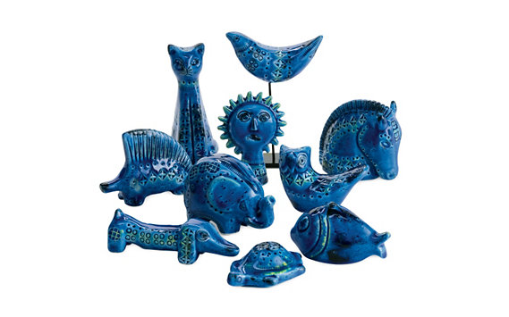
Aldo Londi is without a doubt one the single most skilled designer working within the pottery industry. For years his designs have overshadowed many, simply because of his innovation in techniques, use of colour and stunning designs. He started using pottery at the age of just 11, and went on to become Art Director of the famous Bitossi family ceramics studio. What has particularly caught my eye is his Rimini collection, his most famous style of work featuring textured surfaces and a bright blue glaze. He has created animals, vases and bowls, all using this bright blue pallet. If you’re looking for something with a classic, popping design yet is still unique look no further! My personal favourite has to be the little sausage dog sculpture, it looks so cheeky with its long body and bauble nose! You can buy a large range of these iconic pieces at Heal’s.
Sophie xo


Tuesday 5 June 2012

Donna Wilson Prints


I know for a fact that I have posted about Donna Wilson before, but I love her work so much I just have to do it again! It’s so fresh and bright, she uses bold yet simple shapes to create pieces that are familiar and homely. I think last time I wrote about her it was her cushions that had caught my interest, this time it’s her artwork. These Giclee prints are A3, my favourite are the three animals, they are perfect as a set or just on their own. If I had to choose one in particular it would have to be the fox, I love that bright hot orange which really brings out the little snippets of green. I’m totally all over these, you can find out more information here, and if you don’t know Donnas work already I strongly advise you get to know it!!
Sophie xo


Jasmine Way glassware


The last few days have been pretty exciting over at my house. I have started looking for a new house and today we have finally settled on the area we want to move too! Which means the reality of getting to buy loads of new stuff, and decorate a new house is coming extremely close! One thing I have realized I don’t currently have is wine glasses, and when I saw this amazing glasswork from Jasmine Way I knew I had my new glasses set! These beautiful, intricate colorful pieces have hot summer written all over them! The variation of colours, pattern and types of glass is broad and covers all occasions. I have fallen for these Portuguese glasses, although not your classic wine glass these chunky stemmed beauties have been hand pressed by a family run glassmaker in Portugal. With 6 different colours to every set, they are the perfect pieces for mix and match dining all year round. I am also a big fan of this dark purple decanter, it looks so dark and brooding, and something I never thought I would find in glassware!  Have a look here for more details.
Sophie xo


Monday 4 June 2012

My London baking tins


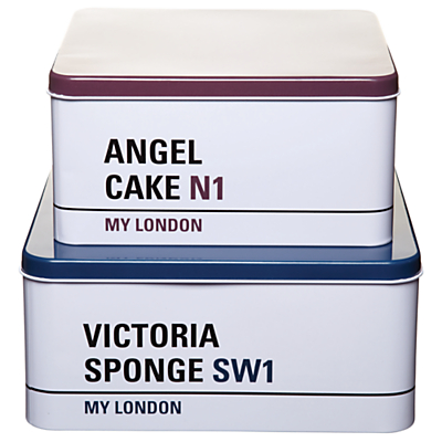
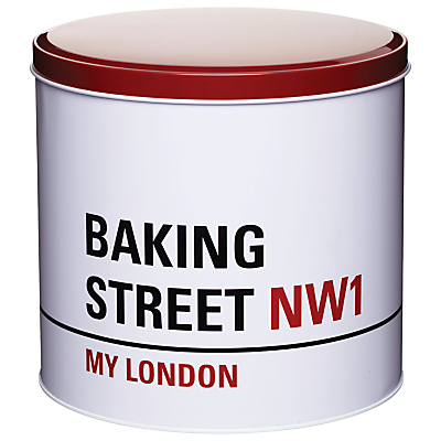
So this weekend in London has been the Jubilee, for everyone this means an extra two days off, lots of parties and watching the royals do their thing. For Londoners it means loads of people bombarding the tubes dressed in Union Jacks. I have to admit I haven’t celebrated the Jubilee in the slightest, why? Probably because I’m just grumpy but I wanted to choose something a little bit British to share with you…to get into the spirit. So after a little bit of chin scratching I have settled for something particularly London based. I saw these adorable tins in John Lewis and pretty much just fell in love, they are simple and maybe a little lame but I just really want them in my Kitchen. Personally I like the Baking Street round tin, perfect for those cheeky biscuits I want to stay hidden! You can get them here!
Sophie xo